Campaigns
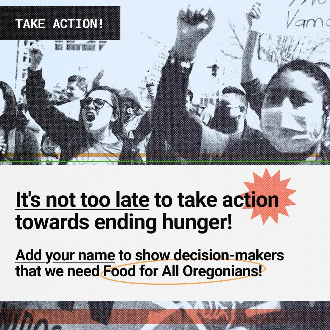
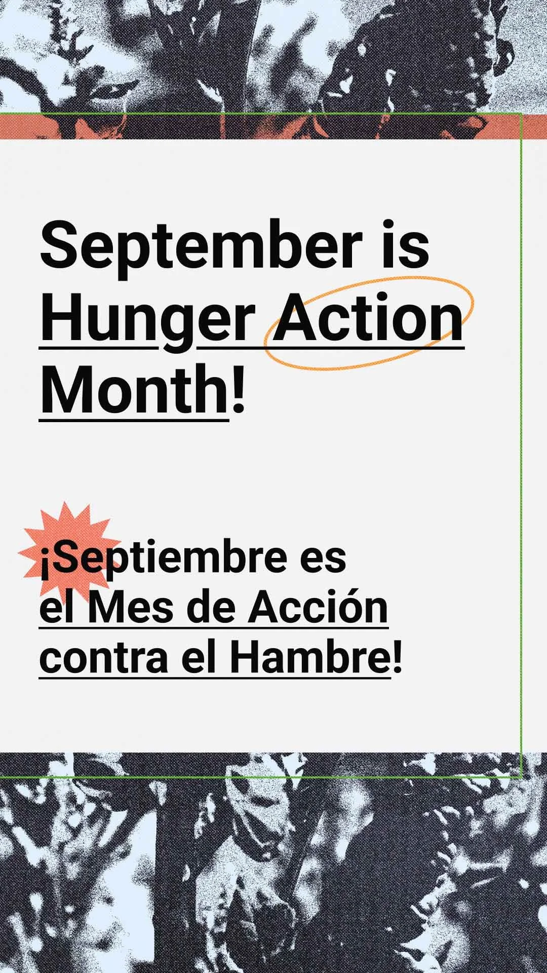
Oregon Food Bank
Hunger Action Month
Working closely with Kat Black, the amazing graphic designer at Oregon Food Bank (OFB). We worked together to build campaign visuals that could merge the OFB brand with the Food for All Oregonians legislative initiative. Collaborating closely, working to build off each other’s designs was an invigorating experience. Together, we merged the brands in an engaging and creative way.


Exploring Your Potential
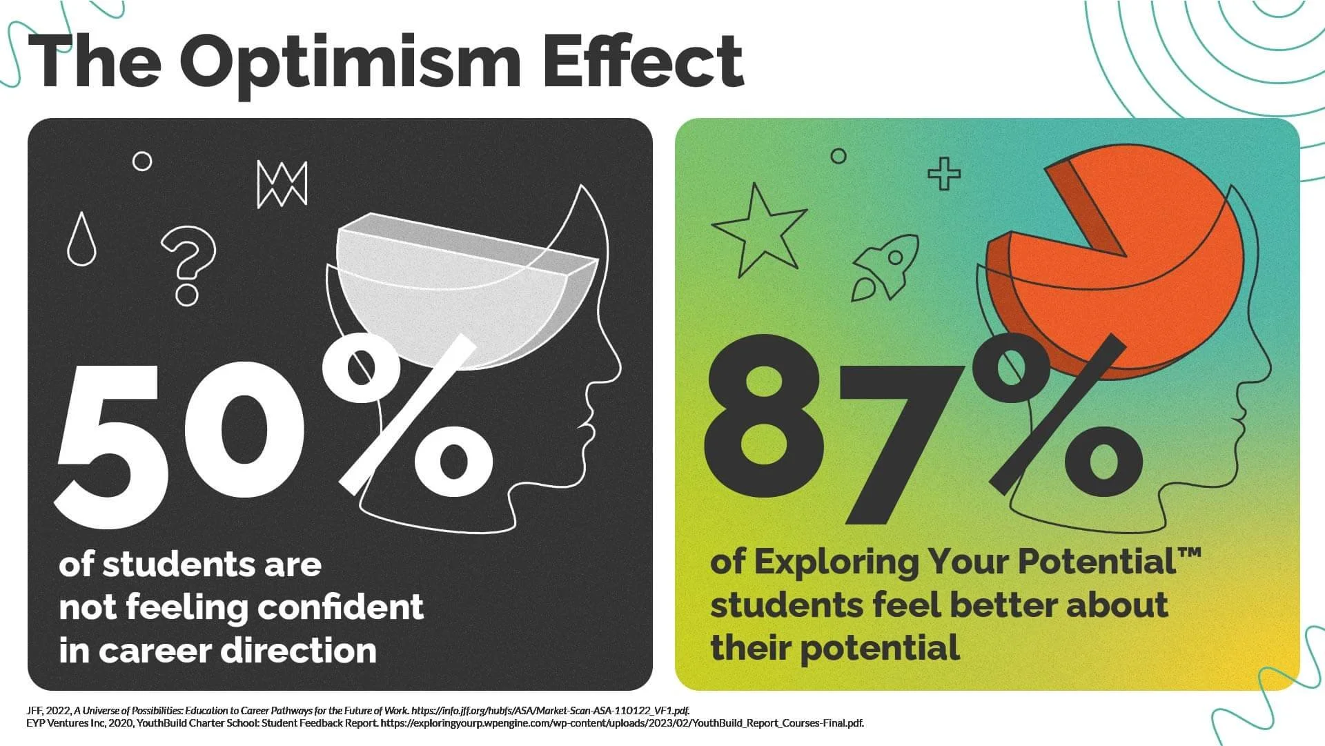
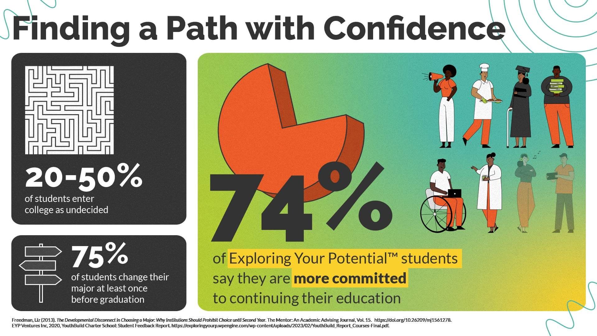
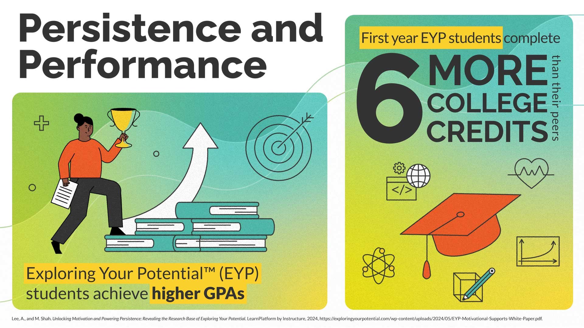
EYP came to me seeking infographics for a promotional campaign that would primarily be used on LinkedIn. The company was looking to attract new audiences, potential clients. The request was to use their colors but otherwise explore the far reaches of the brand. I took this as an opportunity to showcase what the brand could be by developing gradients, introducing text highlights, and creating a set of icons that could match a set of stock character illustrations, which they could use going forward.
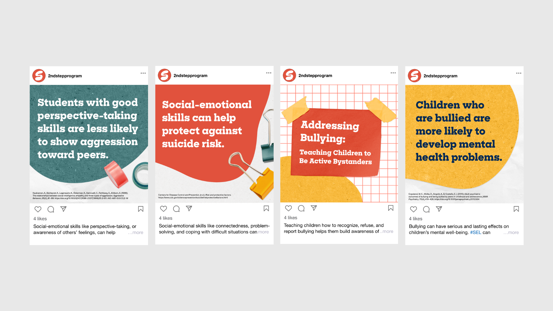
Second Step
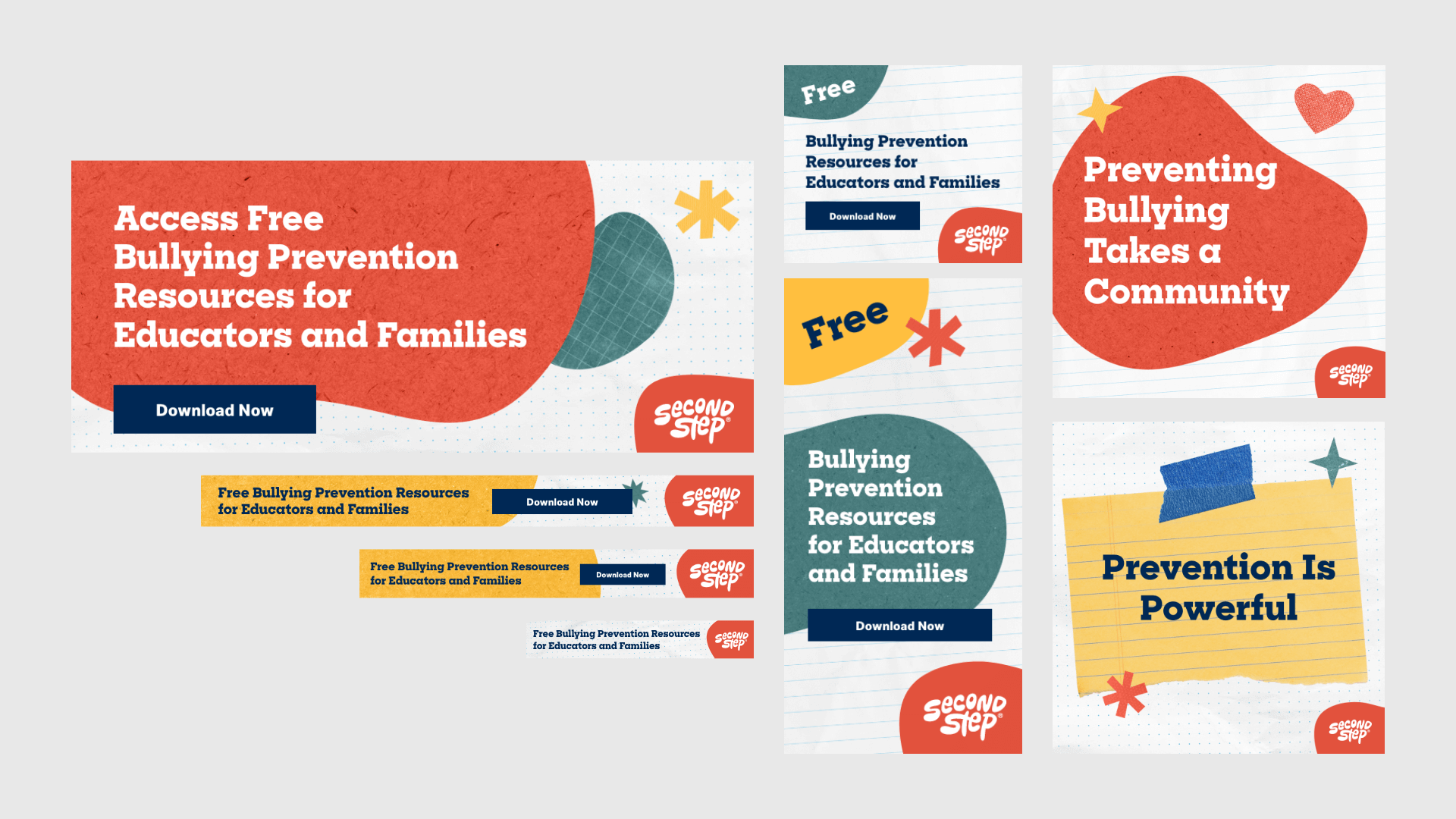
Visual Brand Update
Starting with a social media campaign, I led the cause for an expanded brand aesthetic. This included the addition of textures, grain, and illustrated spots. The look was so well-received that the creative team decided to expand it across brand marketing materials, from ads to web pages.

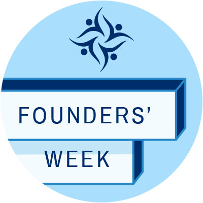
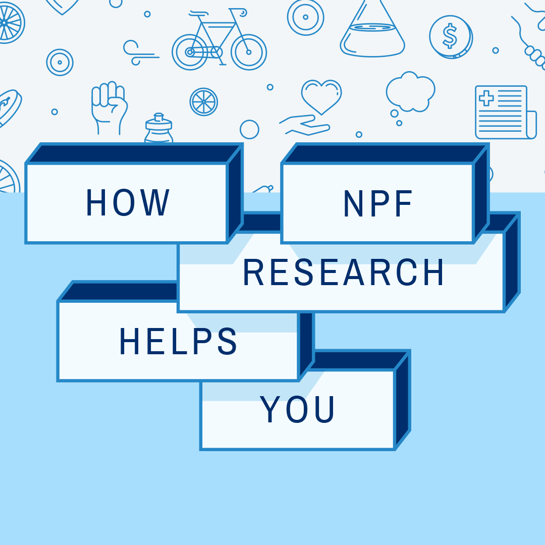
National Psoriasis Foundation
Founder’s Week Initial Campaign
Founder’s Week was a new fundraising driven campaign. This campaign included the creation of icon sets to be used across the brand going forward. The icons aligned with the different operations within the organization: advocacy, fundraising and events, research, and patient navigation.


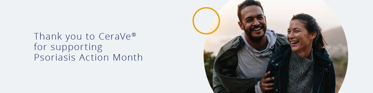
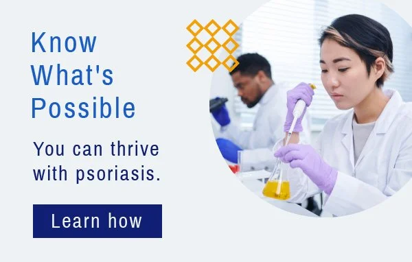
Psoriasis Action Month 2020
This campaign example is following a redesigned website and brand refresh. The site uses shapes and circle containers as abstract representations of the view from a microscope. I showcased the new visuals and refreshed colors in the Psoriasis Action Month campaign.